
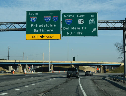
US 75 originally connected Canada with the Gulf of Mexico at Galveston. That all changed in 1987 when it was truncated to end in Dallas. South of Dallas, the remaining segments that were not on IH 45 became SH 75. Currently, Texas is updating all of its big green signs in the new (and stupid) Clearview font. On the new signs along IH 45, every mention of SH 75 along the interstate where there is a new sign is now shown as US 75.
I quite enjoy this, and for one, am heartily pressing for the creation of the San Diego US 80 reanimation society and political action committee. Who’s with me?

IH 45 at SH 75


Resurrect US 80 to San Diego? Sure, why not? :)
Clearview does tend to suck. Douglas County, GA, has used this font for their local street signs. Hopefully, the “Clearview Syndrome” won’t spill over to GDOT BGSes.
Just resurrect only US-80? I taught of others to revive as well like US-21, US-25 in Ohio and of course US-66 ;-)
Clearview is ok but not imaginative as Comic Sans ;-)
What about US 16 in most of the upper Midwest? I heard from Andy Field that in the 1980s around the Wisconsin Dells area that there was a US 16 shield posted on WI 16! The shield’s probably gone now, but I believe WI 16 represents US 16’s former route through Wisconsin.
And what the heck…how about bringing WI 30 back to its original length? So what if it’s a bit redundant… (the short spur of WI 30 used to extend east to Milwaukee (supplanted by I-94) and west to Prairie du Chien (supplanted by US 18))
As a trucker, I like Clearview. It’s easier to read and has a more modern look. Anything that enhances visibility and readability is good…remember, not everyone is a local and the weather isn’t always good so the typeface ought to be bright, big and bold.
It seems these days that departments of transportation are making more and more mistakes when putting together new signs. Incorrect highway icons, misspelled street names, and inaccurate mileages are pretty much the order of the day these days. They need to look things over before submitting them. But make no mistake about this: Texas’ signs do look better than before. I still miss the Series E, but I’ve come to accept Clearview as the font of choice.
And why not resurrect US-81 in TX. Everyday I imagine highway signs having the US-81 shield along I-35 and they should redesignate US-81 in Texas or at least give it a historic designation