
Check out this NY Times Article on highway signs, their fonts, their history, and Clearview.
Blame the Clearview scourge on the elderly, and good salesmen, I say.

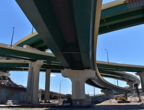
IH 45 north at Beltway 8
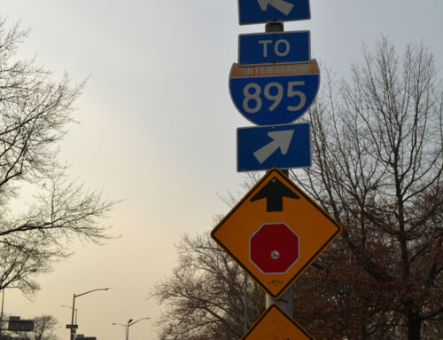
Spot the clearview above… Is highway gothic really that “dangerous”? In its use since 1949 how many hundreds of people have been maimed or killed on our nations highways because of a font?


There’s a sign on I-95 northbound (and southbound) that says “Historic Old Towne Petersburg – Washington St. – Wythe St.” in the Clearview font. I like Highway Gothic better.
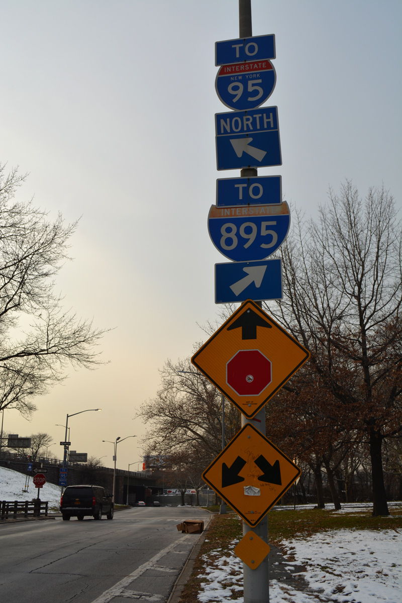
From a standpoint of tradition, I like Highway Gothic. But the above photo makes the article’s point: Clearview is easier to read.
Just discovered the site and blog today … very nice.
Anyone else think clearview looks like trebuchet?
The scourge of Clearview has been found in Arizona…the next batch of photos has a few Clearview signs on I-10 in it.
The NY Times website asks for registration. Can you paste the article onto here. Thank you.
At least California doesn’t have to worry about this. We are so behind that we barely started using the new-reflective signs…WITH EXIT NUMBERS! The law was passed to use these over 10 years ago! I wonder if California is one of the states that requested these new fonts.